The Asymmetric Nokia Lumia 815
Designer: Edgar Mkrtchyan
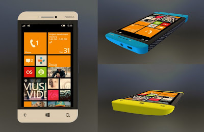
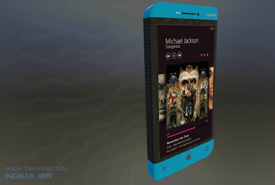
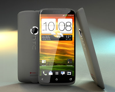
It seems that Edgar Mkrtchyan has taken a vow to give us enough Nokia concept phone designs to make us feel lost. This time Edgar is here with Lumia 815, the phone with an asymmetrical design. This is a music phone and looks like pretty bulky. However, looks can be deceptive. Let us find out more.
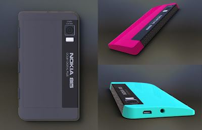
The asymmetry of the design enters at both left and right of the phone. While on the left lays the huge area dedicated for the speakers, on the right are the camera, volume and power controls. This slightly thin right edge and relatively thick left side is intended also for giving a solid grasp over the phone. Let us now take a look at some of the technical specs of the phone and see what Edgar has envisioned this time.
Technical Specifications
Display
|
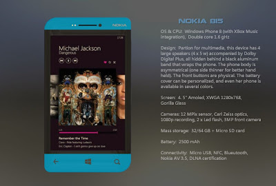
4.5" diagonal | 1280x768 px | AMOLED Screen | Gorilla Glass Protection
|
Sound
|
4 Speakers | 5 Watt each speaker | Dolby Digital Plus tech
|
Camera – rear
|
12 MP sensor | 1080p video recording | Carl Zeiss Optics
|
Camera – front
|
3 MP
|
Flash
|
Dual-LED
|
Physical Buttons
|
Present
|
Storage
|
32 GB and 64 GB Models
|
CPU
|
1.6 GHz | Dual-Core | Special Multimedia Partition
|
OS
|
Windows Phone 8 | Xbox Music Integration
|
Slot
|
microSD
|
Battery
|
2500 mAh
|
Certifications
|
DLNA and NFC
|
Shape/Type
|
Asymmetric | Bar | Music Phone
|
Conclusion
The specs included here are very much realistic and if ever Nokia plans to work with this design, we can see this phone pretty soon in the market. However, I don't think this is going to happen. Asymmetric designs do not make an impression in today's world. On top of that, this is the era of slim waistlines. This concept phone design misses that element. I don't like the model rendering much. What about you?

Comments
Post a Comment