CocaCola Phone Concept – Funny But Good
Designer: DavidCarrillo
What would happen if CocaCola designed
a handset for you? Can't think? Well, then don't because, David
Carrillo has thought of it and created a design that looks funny but
is definitely good. Let us take a look at the specs and phone and
yes, do not forget to click on the images if you want to get a bigger
view of the photos.
If you are looking for a highend
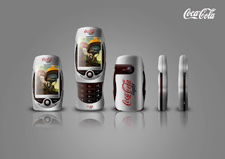
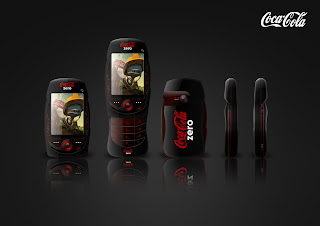
concept phone, this is not the one. This is a slider phone. Not just
any simple slider. The front part takes the shape of a coke can! The
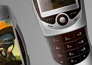
part that slides out also looks very sexy! Reminds me of women with
sexy waist. The slider has the alpha numeric keypad.
On the front you can see a small button
like structure and I have every reason to assume that it is the
trackpad. The phone does have a front and a rear camera. The phone
looks bulky and yes, the body must not be any other material but
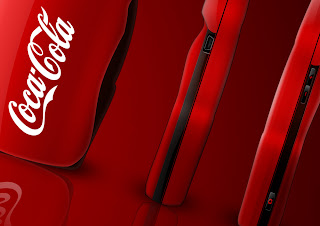
plastic. CocaCola logo is etched on the body of the phone which will
make you think of this device as coke can at the first sight.
No specs are mentioned so, I guess, you
and I are free to add some specs that we think will be the best for
this funny device. However, don't go overboard.
Source: Behance


Comments
Post a Comment